Nobody renovates a room and thinks about the skirting boards first. They’re one of those details that only register when they feel wrong. Too bright against a moody wall. Too yellowed against fresh paint. Too there, drawing a hard line across the bottom of a room that would otherwise feel seamless.
And yet, the decision to paint them the same colour as the wall or keep them white (or something else entirely) has a surprisingly big effect on how a room feels. It changes the perceived height of the walls, the mood of the space, and whether the architecture reads as intentional or inherited.
It’s a small choice. But it’s not a neutral one. support everything else.
The case for painting the skirting the same colour as the wall
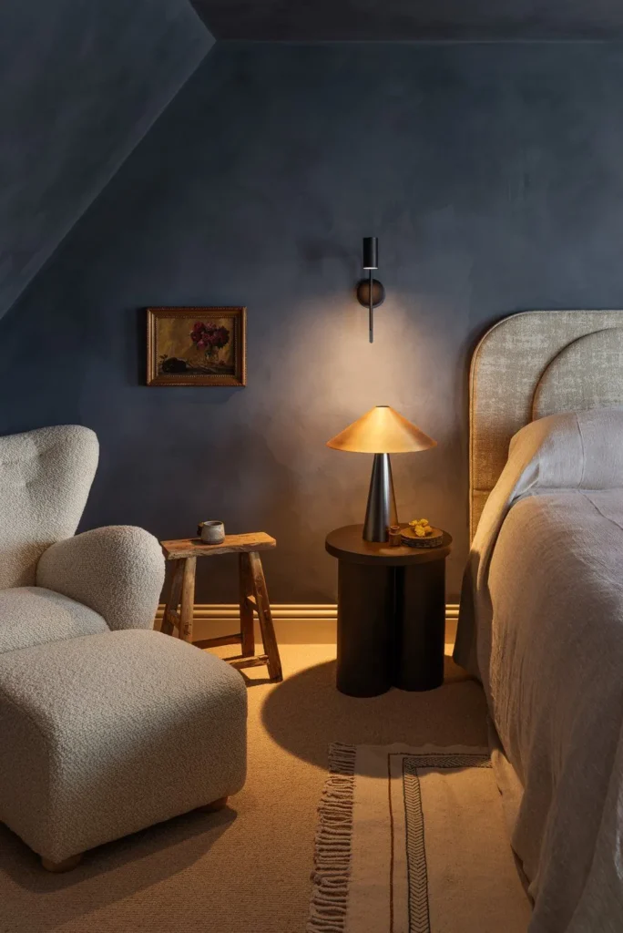
This is the approach that’s gained serious traction over the past decade, and for good reason. When skirting boards disappear into the wall, the room feels immediately taller and calmer. There’s no horizontal interruption at ankle height, no visual “break” that segments the space. The eye moves from floor to ceiling without stopping, and that continuity makes everything feel more open.
It’s a particularly effective move in rooms with lower ceilings. If you’re working with 2.4m walls (as most modern builds are), a white skirting board draws attention to where the wall meets the floor and quietly reminds you how compact the room is. Remove that line and the space breathes.
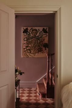
In older buildings, tonal skirting is even more forgiving. Walls that aren’t perfectly straight, floors that slope slightly, corners that aren’t quite 90 degrees: all of these imperfections become more visible when you outline them with a contrasting strip of paint. Matching the skirting to the wall softens those transitions. The room reads as one surface rather than a collection of slightly uneven parts.
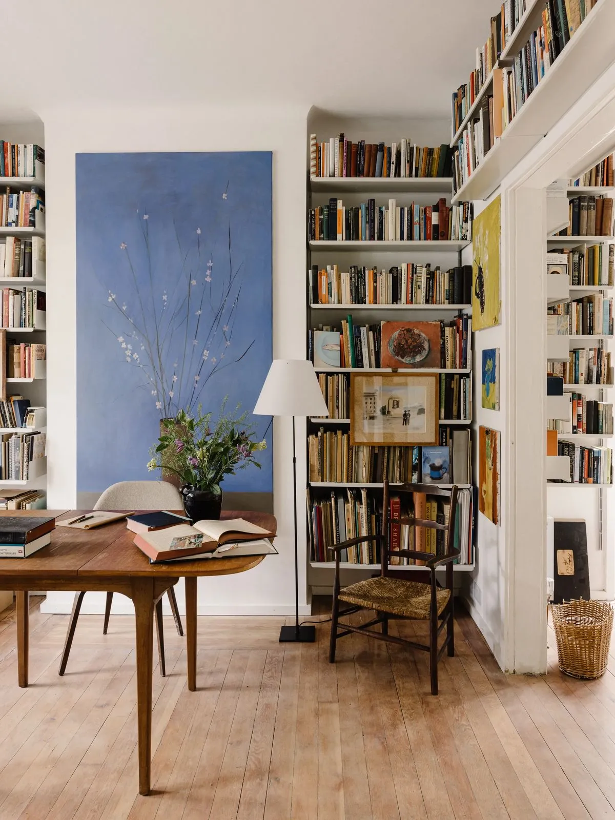
This approach also tends to put the focus where it belongs. When the trim disappears, the materials and furniture in the room come forward. The rug. The sofa. The art. A room where the architecture steps back can feel more gallery-like, more considered, more about what’s in the space than the space itself.
One important note: matching the colour doesn’t mean matching the finish. Skirting boards take a beating (shoes, vacuum cleaners, furniture legs, children, pets) so using a satin or eggshell finish on the trim while keeping the walls in flat matte is the smart move. The colour reads the same. The sheen difference is barely noticeable. But the skirting will be far easier to clean and far more resistant to scuffs.
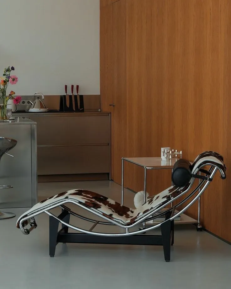
The case for keeping the skirting white or contrasting
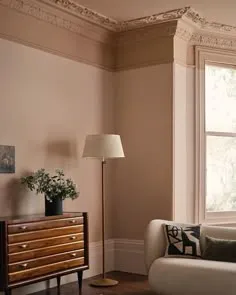
There’s a reason white skirting has been the default for so long, and it’s not just convention. A contrasting skirting board introduces structure. It frames the base of the room, defines where wall ends and floor begins, and gives the architecture a sense of proportion.
In rooms with tall ceilings, classical mouldings, or period detailing, this framing effect can be beautiful. It celebrates the bones of the space. A Victorian terrace with deep skirting boards, picture rails, and detailed cornicing looks best when those elements are picked out, not hidden. The architecture is doing work, and contrasting paint lets it be seen.
Contrast is also useful when the floor is dark, busy, or visually heavy. A herringbone parquet, a dark stained timber, or a bold patterned tile can feel like it’s creeping up the wall without a clean break between the two. White or pale skirting acts as a buffer, a breathing space between two surfaces that might otherwise compete.
And there’s something to be said for the crispness of it. A well-painted white skirting against a richly coloured wall creates a sharpness that can make a room feel precise and deliberate. It’s a more traditional look, but traditional doesn’t mean outdated. In the right context, it feels as considered as any contemporary approach.

The one thing that never works
Here’s where most rooms go wrong: the almost-match.
An off-white skirting against a warm white wall. A cream that’s close to the wall colour but not quite. Trim painted in a different shade “because it was already that colour” or “because the painter had it left over.” These read as accidental. Like nobody made a decision.
The strength of both approaches (tonal and contrasting) is clarity. Matching works because the skirting genuinely vanishes. Contrast works because the separation is intentional and sharp. The in-between does neither. It draws the eye to the skirting without giving it a reason to be different, which is the worst of both worlds.
The same logic applies beyond skirting. Door frames, architraves, window trims: these should all follow the same system. If the skirting matches the wall, so should the door frames. If the skirting is white, keep the rest of the trim white. Consistency is what makes either approach look deliberate, and inconsistency is what makes a room feel like it was painted in stages by different people with different ideas.
How to decide
This isn’t really a trend question. It’s a spatial one.
Ask yourself what the room needs. If the ceilings are low, the walls aren’t perfectly straight, or you want the focus on furniture and materials rather than architecture, go tonal. Paint the skirting the same colour as the wall and let the room feel seamless.
If the ceilings are tall, the proportions are generous, or the period detailing is worth showing off, keep the skirting white or contrasting. Let the architecture have a voice.
And if you’re unsure? Test both. Paint a section of skirting to match the wall and leave a section white. Live with it for a day. You’ll know immediately which one makes the room feel right.
The important thing is to choose. Commit to it. Carry it through the room.
Small detail. Big impact.
Should I paint skirting boards the same colour as the wall?
It depends on what you want the room to do. Matching skirting to the wall creates a calm, continuous feel that makes walls appear taller and hides imperfections in older buildings. It’s a strong choice for modern interiors, lower ceilings, and spaces where you want the furniture and materials to be the focus.
What finish should I use on skirting boards painted the same colour as the wall?
Use satin or eggshell on the skirting, even if the walls are flat matte. The slight difference in sheen won’t be visible from a normal distance, but it makes the skirting much more durable, easier to wipe clean, and resistant to scuffs.
When should I keep skirting boards white?
When the room has tall ceilings, period detailing worth celebrating, or dark floors that need a visual break. White or contrasting skirting adds structure and definition. It works well in traditional interiors and any space where you want the architecture to be part of the visual story.
What about painting skirting a completely different colour?
It can work, but it’s a bolder move. A dark skirting (charcoal, deep green, navy) against a lighter wall can look striking and grounded. Just make sure it’s a deliberate contrast, not a half-step. And carry the same colour through the other trim in the room so it reads as a system, not a one-off experiment.